Thursday, June 18, 2020

Proposal - section 5 - GROWTH & DECAY - Final Piece and Evaluation.


This is my Final Major piece. Whilst experimenting with different techniques and materials before starting my final piece, I found that acrylic paints would work best for the portraits, due to how well they blend, and how easy it was for me to mix different colours to get the accurate shades and tones for my painting. It took me two attempts to do the portrait of my Grandad, in the first attempt, I found that I was using the wrong colour palette, the tones I was using were way too brown toned, whereas in the original photograph of him his skin is more red/orange toned. Another issue I faced was once the portrait had dried, the grid guide I had drawn underneath the paint was still visible, so I decided to start again, however this time taking those issues into consideration. The second and final attempt I was much happier with how the painting had turned out, I also found that the painting turned out much better also, as a result of me focusing on one area of the portrait at a time, as when the paint is still wet, it is able to blend and this mean no harsh unblended lines are visible. Once I had found what works and what doesn’t work when working with acrylic paints, I made sure I took this into consideration also when doing the portrait of my brother. When painting the hair on my Grandad’s portrait, I found it difficult to create opaque, fine white lines with the paint brush and paint, therefore I decided to attempt to use a white ink pen, which I thought worked really well.

I initially planned to paint a plain solid colour for the background, like Marcelo Monreal does with his pieces, so that the attention isn't taken away from the actual portraits and so that the painting overall wasn't to busy, however I noticed that in the original photographs, the backgrounds only have nature in, which was fitting with the concept of my work. The colours that are involved in the backgrounds are very similar as well, so once they were next to each other I knew they matched and complimented each other.

Originally, I planned on also doing a portrait of my mum as well. However, I decided to only do a portrait of my brother and Grandad instead. I thought that if I just did these two portraits instead, the difference of growth and decay would be more apparent. Another reason I haven’t done the portrait of my mum, Is because when planning my time sheets I realised I would not have time to complete all three, however I am pleased I didn’t do the third portrait, because I don’t think the final outcome would have looked as effective if I was to have done so.

When looking back at my piece, if I was to do this again, I would consider painting the portraits at a larger scale, now that I am comfortable and know that I have developed my skill of painting portraits.
I would also think about how I could make them more three dimensional, my raising the sectioned pieces more, which I think would make it look much more effective. Another option I thought about afterwards, was to use more real pressed flowers, and bringing real nature into my artwork.

Bibliography

Here are the resources that I used, to expand my knowledge on the artists I had chosen, As well as to find research gain inspiration:

Proposal:


Maria divans research :

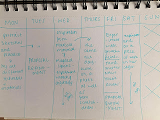
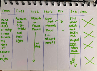
My Time planning sheets for my planning as well as my Final Major piece.

These are my timetables for every week leading to my final major, the final two timetables are when I did my final major pieces. I found that planning what I was doing each week kept me on track and made sure that i wasn’t falling behind with my work. 


Wednesday, June 17, 2020

flower studies and Photoshoots


This is a photoshoot I captured of a bunch of flowers when they were in full bloom as well as when they started to decay, and fully decayed. I took these photos, as a result of the whole meaning behind my work is growth and decay, and with flowers I am able to capture that with my own eyes and camera. With these photos, I am going to use them as references, and paint them and do some flower studies.


I did these two flower studies using acrylic paint and each one took around 30 minutes. I’m really happy with how these have turned out and I now know that i definitely want to use acrylic paints for my final piece. 


portrait of my brother... Experimentation with Acrylic paints


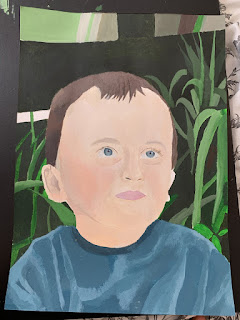
As I found that the grid method worked well to draw out a rough sketch of the outline of the portrait of my Grandad, I decided to do the same for this portrait of my brother. Once I completed the outline, I then erased the grid, and started to paint using Acrylics. When painting the skin tones, I found it really difficult at the start. As a result of my brother having a lot paler skin complexion compared to my Grandad, I struggled to figure out how to shade and highlight the face with lighter shades and tones.


Looking back at where I was with the  portrait so far, I realised my brothers hair was a little darker and ashier in the photograph compared to the colour I had started to paint. Therefore, as you can see in the above photo I decided to repaint the hair once the previous paint had dried. Once I was at a stage where I was happy with how the portrait was looking, I decided to complete the background. I found that the background added lots of contrast to the painting overall, with the balance of light and dark colours.


Then, I moved on to sectioning with portrait with a Scalpel knife. Before going straight onto the portrait and potentially going wrong, I first photocopied the painting and cut out the photocopy where I thought about sectioning the portrait, meaning I knew what I was going to do. I layered the parts that I cut out which added dimension to portrait which I found to look effective.


After doing many flower studies, I came to the conclusion that acrylic paint looked most effective, vibrant and realistic and fittest best with the rest of the portrait when put together. Therefore, I started to add some of the flower studies I had done to the portrait. After doing many flower studies, I found that acrylic paint worked best for me, due to how easy they are to use and create small details and blend colours together.


This is the final outcome of the portrait of my brother. I made sure the flowers were behind the face as well as I front, to add a more realistic, overgrown full effect.

I fractured the portrait of my brother, to reveal vibrant flowers and leaves as well as flower buds, in attempt to represent that he is young, full of life and always growing (just like a flower). It also portrays his beautiful, bright personality – even though others may see him as maybe shy, until they get to know him, they find that on the inside he is a full of energy and happiness.

Sunday, May 24, 2020

Portrait of my Grandad... Experimentation of Acrylic paints


This is my first experiment of doing a portrait of my Grandad in acrylic paint.. I started off by sketching out a measured grid of the original photo of him, therefore I knew I would get accuracy in  proportion and size of his facial features.


Using the grid as a guide was also useful as it allowed me to figure out and guided me on where to place certain shadows, the lighter areas as well as where the creases exactly are in the t shirt.


After making major progress on the portrait, I reassessed what I had done so far. When looking back on the original photograph, I noticed that I had started painting what I thought would look right, instead of looking at the correct placement of things such as the neck. I added a darker shade under the neck, which gives the illusion of my Grandad's neck to be a lot longer and slimmer than it looks in the photo. Furthermore, I found that I was using the wrong colour palette of shades, the wrinkle lines along the forehead have been painted on way to dark. In the original photo, my Grandad's skin is overall more red toned, however I noticed when taking a step back and looking at the painting I had mainly used brown toned shades instead, which does not look real skin-like at all. Once reassessing, and before making more progress on this painting, I decided to restart this portrait, however this time be more cautious of what shades I am using.


I started this painting once again - using the grid for guidance of the outline of the portrait, making sure the proportions of the facial features were accurate, however this time I erased the lines once I had the outline complete, this is because when looking back at the other portrait I attempted to do, I noticed that you could see the guide lines through the paint once it had dried. Also, as you can see in the photograph I have used a completely different combination of skin tone shades, which are a lot more red/orange toned instead of brown. On the forehead I added a lot more highlights in the centre, as there were in the photo. Once I added those highlights, I automatically noticed the painting looked more three dimensional.

To make mix the different shades and make sure they're all within the same colour palette, I made sure I was happy with the main skin colour of the face I was using, then once I had that correct, to create shadows I added a tiny bit of brown paint to that colour, and to create highlights I added a certain amount of white, depending on how light I wanted the highlighted areas to be. In the last painting I created of my Grandad, I noticed that I layered the skin tones once they had dried, as well as the shadows, which did not look realistic as they weren't blended with the other skin tones on the face. The shadows I created on the top of the forehead in the previous painting looks too brown toned and looks quite 'muddy'. I learnt from this, therefore in this painting I fully focused on one area of the face at a time, meaning that the paint would be more blended and seamless (which is more realistic) as it is still wet and moveable.


 This is the final outcome of the portrait of my grandad, for the cutting out process, I did the same as I did for the portrait of my brother. In the background of the original photograph, in the left corner there was a tartan-like print umbrella. I decided to make it black instead, due to the fact that I wanted the main focus to be the portrait, not the background and I found that the umbrella would be a distraction, and would also make the painting very busy. For the flowers on my grandads portrait, I used more dual colours for the flowers to make them look like they were decaying. The flowers represent that he was once full of life, however is also starting to decay as he gets older. The colourful use of flowers represent his personality, he may seem quite and a little shy to people who don’t personally know him, but once you know him, you know that on the inside he is a beautiful person. 


Experimentation of digital artwork


Within this project, I wanted to experiment and expand my knowledge on how to do/create digital art. I was inspired to do this from the artist Marcelo Monreal, who I have been doing in-depth research on. All of his artwork is created digitally with photoshop, where he fractures portraits and puts flowers behind the faces. As a result of me not having photoshop, I found an alternative free app on my iPad called ‘Bazaart’ which allowed me to create the same effects to my photo, as photoshop did for his.


This is the picture that I chose to cut out sections of my little brother, I chose this picture as a result of it being at a certain angle where the face will still look right once it has been cut out, as Marcelo Monreal says, depending on the angle of the photo, the cut out can either turn out good or bad. The Bazaart app is also quite similar to Procreate, as it allows you to add and lock layers, cut out images and sections, change opacity of the photo or layer, add in other images and backgrounds as well as stickers and text.


Here are pictures of the process:


I started off by cutting out the right half of his face using the cutting tool. I added a thin line  around the perimeter of the cut out, a little darker than his skin tone, as I found that this added depth to the cut out section.


On the Bazaart app, there are a variety of flowers, which I cut out and added to the cut out section. I allowed some of the flowers to lay over the top of the cut out, and also sent some to the back of the photo. This makes the flowers look layered and look like they are actually blooming from behind his face.

Marcelo Monreal added multiple cut outs to his pieces of work, which inspired me to attempt the same, therefore I added another cut out on the left side of my brothers face, doing the exact same steps as I did with the other cut out.

When doing this section of his face, I decided to do something a little different which I had seen Monreal do in a few pieces of his work,  where he adds multiple layers and rings of skin to one section of the face. I found that doing this made the section a lot more 3D, as if the skin section was actually away from his face.

I then added the cut out face section and the other piece of skin that I had cut out, back into the picture. I realised the face looked unrealistically placed back onto the picture, therefore I decided to add a shadow behind it, as well as behind the other section. This made the section look even more like it had actually been broken away from the  and more realistic.


Proposal - section 5 - GROWTH & DECAY - Final Piece and Evaluation.

This is my Final Major piece. Whilst experimenting with different techniques and materials before starting my final piece, I found t...